 anu.
“Today’s weather” shown as a proposed Malayalam label. A complete translated flow still requires review with native speakers.
Design concept · 3 min read
Kisaan Saathi
Simpler information. More useful decisions.
A mobile interface concept exploring access to weather, crop guidance, and market information for Indian farmers. The direction proposes voice support, regional languages, and low-connectivity access.
- Project type
- Design concept
- My role
- UI / UX exploration
- Scope
- App structure, wireframes & key screens
- Tools / output
- Figma · Mobile interface
The brief
Make daily farming information easier to find and understand.
My contribution
Explored the app structure, onboarding, dashboard, crop advice, and assistant UI.
Deliverables & stage
Wireframes and key screens. Next step: regional-language and farmer usability testing.
01 / FIELD NOTES
Start with the
everyday context.
The concept focuses on farmers who need timely, understandable information while managing practical constraints such as language, literacy, and connectivity.
The design direction brings common tasks—checking the weather, viewing crop guidance, and finding market information—into one interface. Voice and local-language support are proposed ways to make those tasks more approachable.
Scope of this studyThis study presents an exploratory interface concept. The next phase is field research and task-based testing with farmers before developing the proposal into a working product.
02 / FIELD NOTES
Organizing around
daily needs.
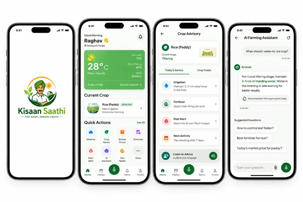
The information architecture groups the home dashboard, market information, assistant, alerts, and profile into distinct areas. The dashboard brings weather, crop status, and common actions closer to the first screen.
The wireframes explore the flow from onboarding and language selection to the main tools. They are layout explorations rather than evidence of validated usability.
03 / FIELD NOTES
Making information
easier to approach.
A green and warm-neutral palette connects the concept to its farming context. Cards group related information, while the microphone and audio actions make the proposed voice support visible.
The current visual studies are in English. Regional-language layouts and outdoor readability still need dedicated design and testing.
Show when information may be stale, retain the last available data, and offer a clear retry action.
Prioritize essential actions, plain language, audio support, and outdoor contrast in the next iteration.
Accessibility is a design goalVoice guidance, readable layouts, and larger touch areas are intentions to validate through an accessibility review and testing in regional languages.
04 / FIELD NOTES
The next step
is listening.
The next phase would involve farmers from a defined region and language group. I would begin with one task—such as checking crop advice—and observe how people understand the information and act on it.
- Create and test a regional-language version of the core flow.
- Show offline, stale-data, and unavailable-information states.
- Explain when location is needed and provide a manual alternative.
- Test text size, contrast, and tap targets on typical devices outdoors.
- Make the assistant’s uncertainty visible and provide a path to qualified advice.
The strongest lesson from this exploration is that usefulness depends on context. A simpler screen is a starting point; research and testing must determine whether it actually helps.
THE NEXT CHAPTER
Good things start
with a conversation.
Hiring for a UI or Visual Designer? Send me the role details, or get in touch about a brand or interface project.