 anu.
Redleaf Press
A warmer chapter for the storefront.
A website visual refresh for an educational publisher. I brought together color, typography, and product presentation to give its desktop storefront a more cohesive character.
- Project type
- Client website visual refresh
- My role
- Sole UI / Visual Designer
- Project context
- Completed at Vtrio Solutions
- Scope shown
- Desktop homepage & product page
The focus
Bring the storefront’s promotional and shopping content into a coordinated visual direction.
My contribution
Homepage composition, color application, typography, and product presentation.
Documented outcome
Went live as designed. The client welcomed the branding, color, type, full-width slider, and more visible cart. The larger scale surprised them: they liked it, and it shaped the changes they proposed next.
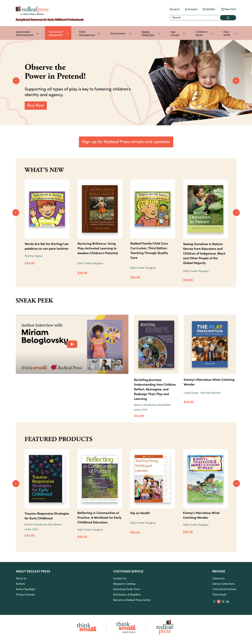
Redesigned desktop homepage · Logo, tagline, and video artwork supplied by the client ·
One storefront.
A shared visual language.
Redleaf Press offers resources for early childhood professionals. Its homepage brings together book categories, promotions, new releases, an author feature, and featured products.
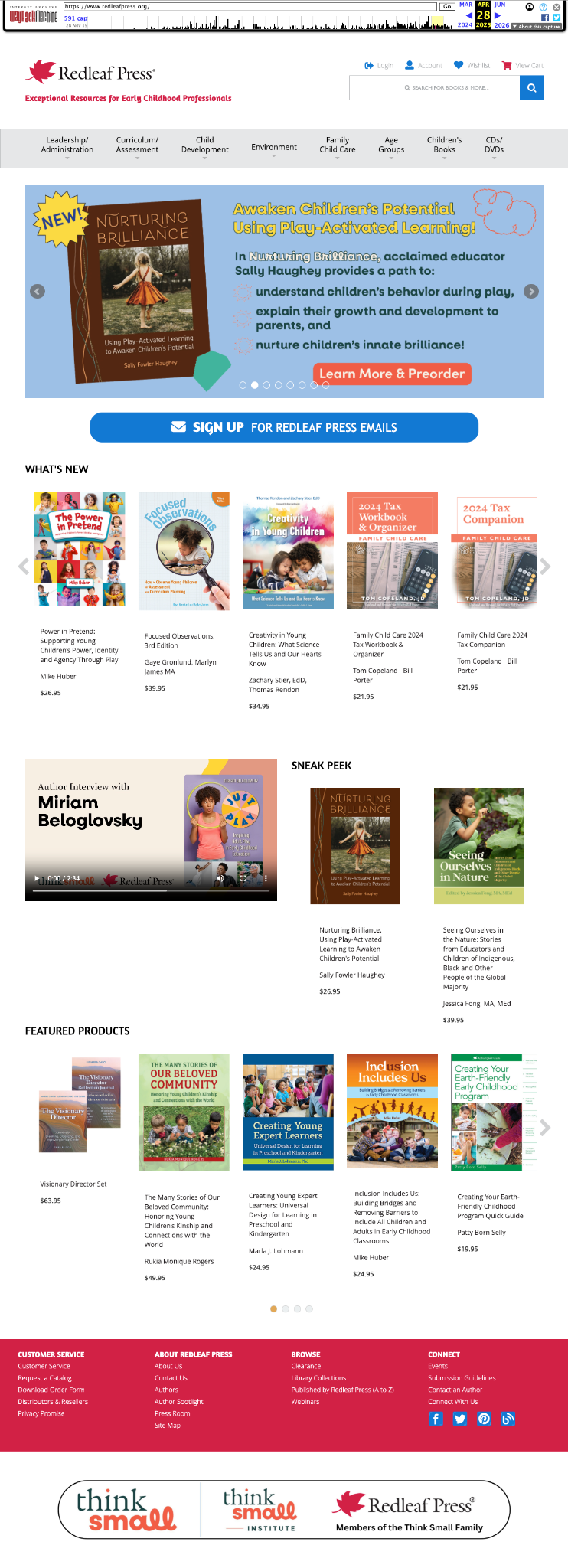
The original page used varied color treatments across these sections. My refresh retained the familiar content groups while giving their typography, spacing, and presentation a more consistent relationship.
I completed the visual design presented here. The project was delivered through Vtrio Solutions, so the client referred to the company’s team collectively in their feedback.
A familiar structure.
A fresh expression.
The comparison shows how the core homepage sections were retained while their scale, color, and grouping changed. Both complete screenshots are shown below. Select Expand to inspect either image at a larger size.
Warm surfaces.
Clearer grouping.
A coordinated palette
Cream surfaces frame the book collections, coral highlights prominent actions, and dark teal anchors the footer. Repeating these colors connects promotional, editorial, and shopping content.
More prominent typography
Serif headings introduce an editorial character, while supporting sans-serif text distinguishes navigation and product details. The larger heading scale gives each section a clear starting point.
A full-width first impression
The opening slider spans the page, placing a concise headline and action beside a lifestyle image. It gives the promotion a stronger presence at the start of the storefront.
Repeated product presentation
White image areas sit within cream section panels. Consistent treatments for titles, author information, and prices bring order to covers with different proportions and visual styles.
Room for editorial content
The author interview sits alongside book features in “Sneak Peek.” Its wider format distinguishes the video while keeping it connected to the surrounding content.
Extending the language.
The product page.
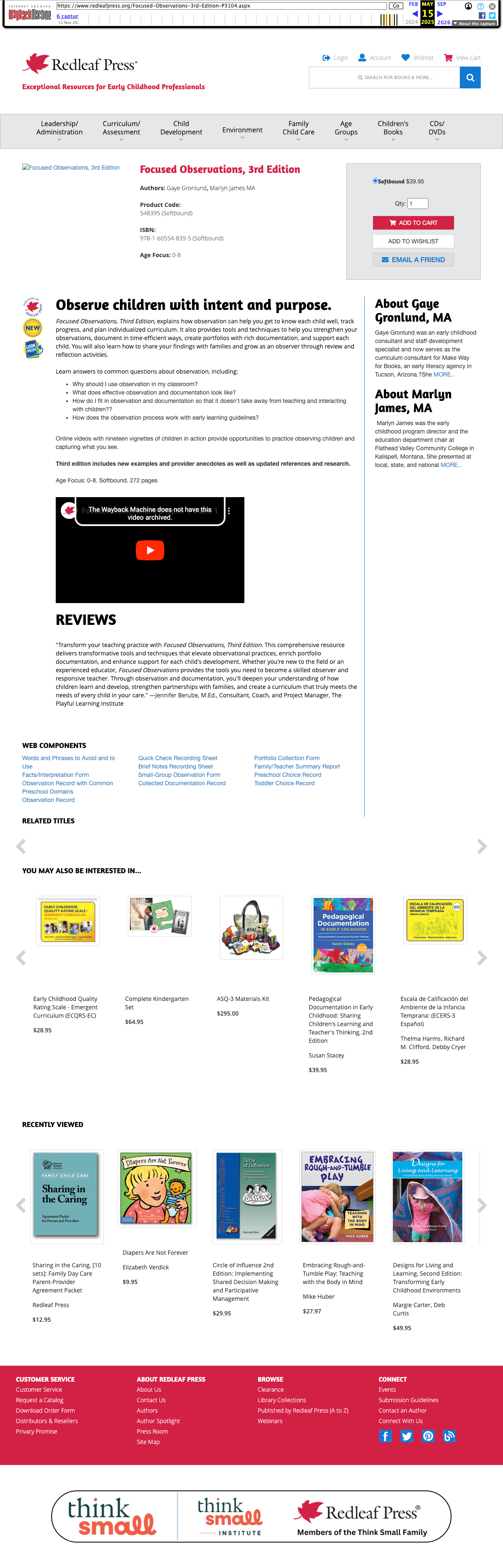
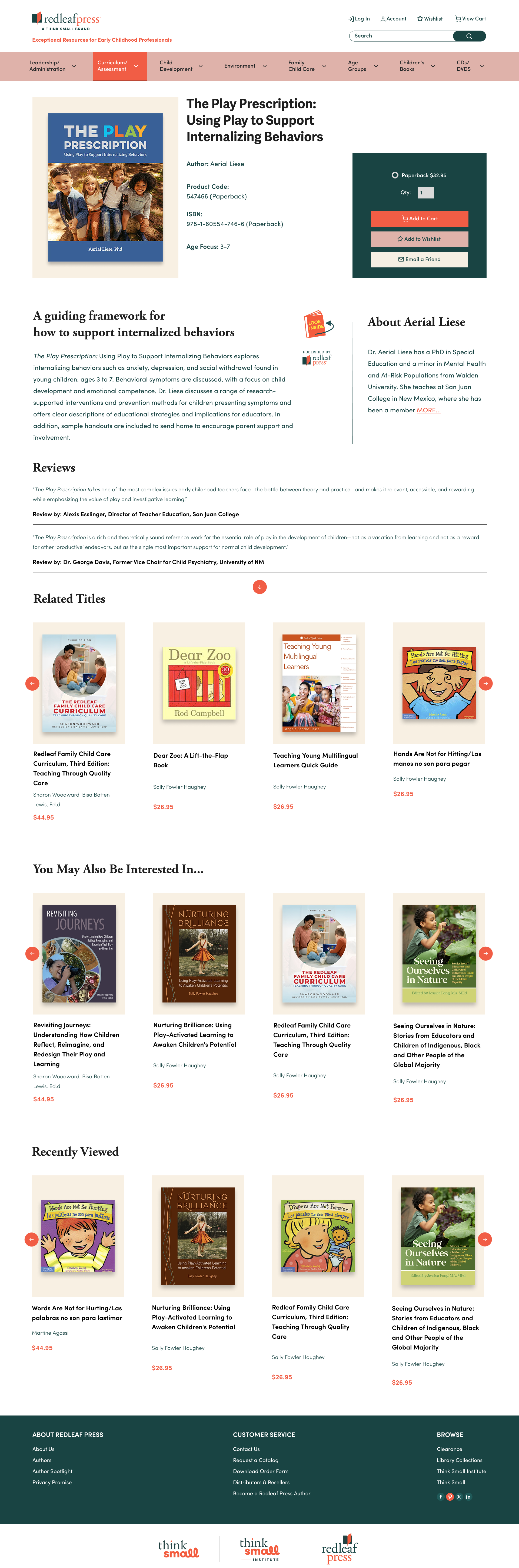
The visual direction established on the homepage was carried over to the product page. This included using the dark teal to anchor the purchase actions, maintaining the cream surfaces for structured content, and applying the new typographic scale to ensure readability for product details, author information, and reviews.
Platform constraints.
Designed to be built.
The storefront runs on AbleCommerce, which limits how far page layouts and components can be customized. A design that ignored those limits would not get built.
I reviewed the direction with the development team across multiple calls and working sessions, adjusting it to their suggestions and to the client’s brand guidelines so every change stayed feasible on the platform.
The result is a consistent color, type, and product-card system that works within the existing platform rather than around it.
A direction
that resonated.
“The overall branding and style look fresh and we are happy with how the team applied the color pallet and type styles.”
Client feedback on the visual refresh · Received through the company
What the client valued
The branding, color and type application, and the full-width slider. On the product page: “we really like that the cart is more obvious.” They also noted that “the larger type font probably is better for ADA compliance.”
The bigger surprise
“Honestly, we did not expect to see the [site] appear so much LARGER. While it is great, it does contribute to some of the proposed changes we need.” I went bigger than the client expected. They liked the result, but it also meant more change requests: a fair signal that I should have agreed on density with them before the full layout.
Scale, and what
I would align earlier.
The larger type scale was the boldest decision in the refresh. It gives each section a clear starting point and makes book titles, authors, and prices easier to read. In the client’s words, it is “probably better for ADA compliance.”
Scale also changes how much content fits on one screen. For the next round, I would keep the approved color and type system and tune density where the client’s proposed changes call for it:
- Let more books show in the first screen by tightening section padding.
- Keep the full-width slider the client liked, with a shorter height.
- Check the result at common laptop widths, such as 1366 and 1440 px.
This project demonstrates my approach to applying a cohesive visual language across a commercial storefront within real platform limits. The outcome is a desktop homepage and product page that went live as designed, with the scale decision as the part I would align on earlier next time.
This is a visual-design case study. It does not claim measured conversion improvements, validated usability gains, or formal accessibility compliance.
Good things start
with a conversation.
Hiring for a UI or Visual Designer? Send me the role details, or get in touch about a brand or interface project.