 anu.
Sloth Streetwear
Drip without rush.
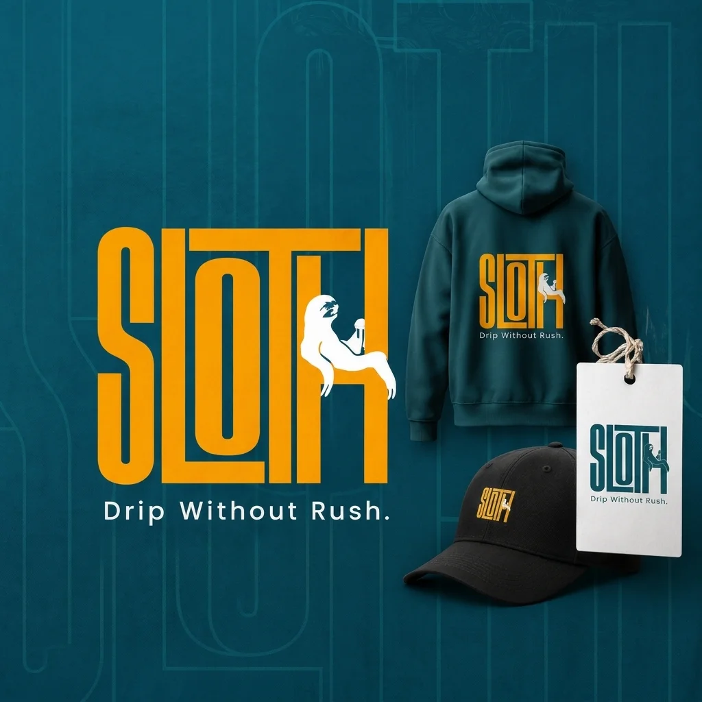
A paid brand identity project for a streetwear label. The brief called for a relaxed but confident personality, expressed through a sloth character and a bold, apparel-ready wordmark.
- Project type
- Paid client work
- My role
- Brand identity designer
- Scope
- Logo & mini brand identity · 1 week
- Tools / output
- Illustrator · Identity applications
The brief
Integrate a friendly sloth character into a confident streetwear identity.
My contribution
Explored the mascot and lettering, then developed the logo and supporting identity.
Deliverables & stage
A logo system, color and typography guidance, and apparel mockups for the client.
A relaxed character.
A confident identity.
The brand needed to feel comfortable within street culture while keeping a friendly, approachable personality. The central design challenge was to integrate the sloth into the lettering without letting the mascot overpower the name.
The identity had to work across apparel and accessories. That made the relationship between character detail, letter spacing, and recognition especially important.
Finding the right relationship.
The exploration moved from character-led sketches toward a more integrated wordmark. A separate mascot made the identity feel more illustrative; closer interaction with the letters gave the name and character a shared structure.
One character.
A flexible system.
The final direction uses condensed lettering for a strong silhouette and a relaxed sloth pose to introduce personality. Deep teal anchors the identity; warm yellow adds contrast and energy.
Supporting typography uses Outfit for headings and Inter for everyday text, with Caveat as an occasional handwritten accent.
Character with a purpose.
This project was an exercise in keeping a character expressive while making the brand name do the main communication work. The clearest direction came from simplifying the relationship between the mascot and the letterforms.
Small-scale reproduction deserves its own testing. Printed labels and embroidery samples would be the next step for verifying detail, spacing, and legibility across materials.
Good things start
with a conversation.
Hiring for a UI or Visual Designer? Send me the role details, or get in touch about a brand or interface project.