 anu.
ShopGenesis,
reimagined.
An editorial retail exploration.
An independent redesign concept for the existing ShopGenesis brand. This study explores how typography, imagery, and a clearer page hierarchy could create a more editorial shopping experience.
- Project type
- Independent concept
- My role
- UI & visual design
- Scope
- Homepage direction & responsive layouts
- Tools / output
- Wireframes · UI layouts
The brief
Explore a clearer, more editorial direction for an existing retail storefront.
My contribution
Developed the visual direction, wireframe layouts, and responsive interface studies.
Deliverables & stage
Desktop, tablet, and mobile concepts. Next step: task-based shopping tests.
A different lens on retail.
The starting point was a dense multi-brand retail storefront. The concept explores a fashion-focused visual direction with more space for product imagery and storytelling.
The scope is visual repositioning: layout, hierarchy, and an editorial brand direction. Before taking the concept further, I would align the audience, merchandising goals, and brand positioning with the retailer.
From density
to hierarchy.
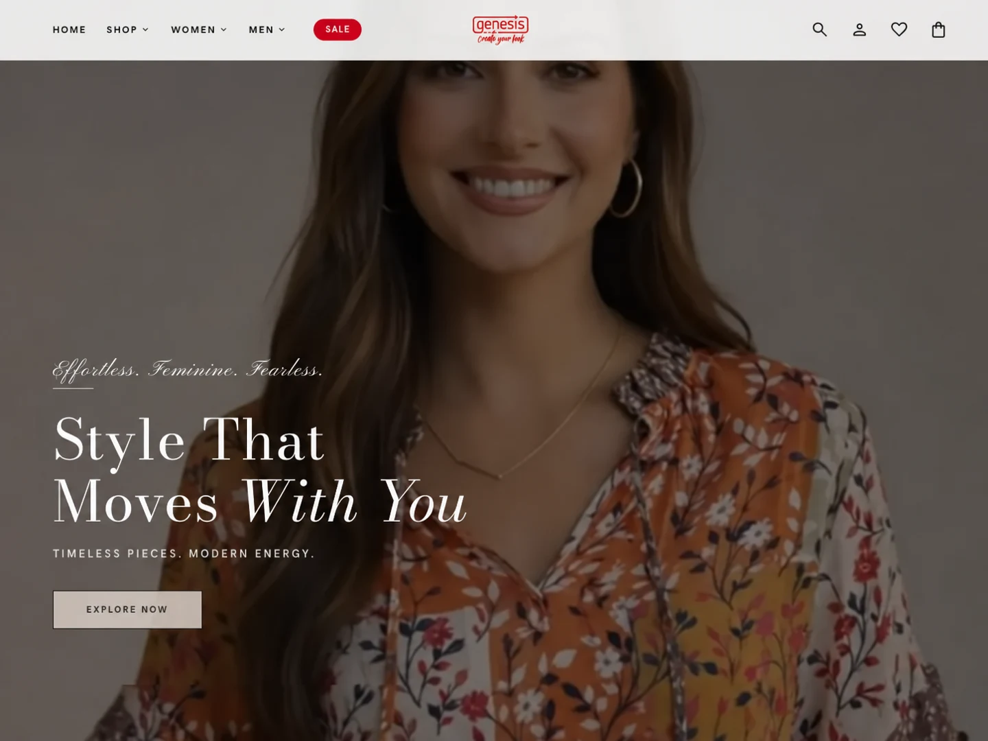
The visual proposal uses larger editorial imagery, serif display typography, and quieter supporting text. These choices create a deliberate pace and separate storytelling from the shopping controls.
Three design priorities
- Clarify the page structure: distinguish the main navigation, collection story, and product discovery areas.
- Give products room: use spacing and scale to reduce competition between visual elements.
- Keep actions recognizable: pair the expressive visual direction with familiar shopping patterns.
These are design intentions. Their effectiveness would need to be checked through task-based testing with representative shoppers.
The visual proposal.
The desktop composition establishes the editorial direction. Tablet and mobile studies explore how the same content can adapt to a narrower screen.
What I would validate next.
A polished storefront still needs to make shopping straightforward. I would test whether shoppers can find a relevant product, understand its options, and reach the cart without confusion.
- Compare product-finding tasks with the original layout.
- Test variant selection, cart editing, and checkout recovery on mobile.
- Check whether motion and editorial sections help discovery or slow it down.
- Measure accessibility and performance on realistic devices and connections.
The takeaway is to treat visual direction as one part of the experience. Merchandising, usability, and business fit have to support the same story.
Good things start
with a conversation.
Hiring for a UI or Visual Designer? Send me the role details, or get in touch about a brand or interface project.